· By Studio
Colour Notes 5.0
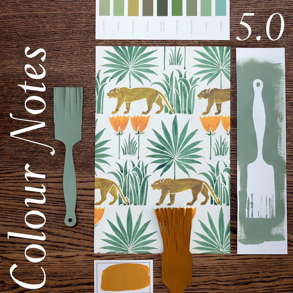


 Today marks the birthday of C.F.A Voysey (1857–1941), one of the leading figures of the Arts and Crafts movement and the artist behind our beloved Lioness & Palms wallpaper.
This design is from a watercolour drawing Voysey did in 1918 that we discovered in the archive at the V&A Museum in London. We knew we had to bring the lionesses back to life the moment we spotted it, and our archival range began.
The following are some colours you might want to pair with the Midday colourway in your space.
THE GREENS
John Ruskin said that, “It is the best possible sign of a colour when nobody who sees it knows what to call it”, and that can be said of our lionesses here. As colour matches we've, firstly, gone for Olympian Green from Edward Bulmer Natural Paints, which is an unusual but excellent pairing to the greeny-brown colour of our lionesses (and in real life is a much closer colour match).
There are so many beautiful options to choose from if you’d like to bring out the greens of the palms and grasses. Salvia from Paint and Paper Library is perfect for delivering deep aqua tones. Also lovely is Aquamarine Deep from Little Greene, which brings coolness and an air of calm, with a distinctively luxurious feel. And we have seen our Lionesses partnered on various occasions with Edward Bulmer's Verdigris. A particularly memorable example is in this writer's flat in Edinburgh designed by the wonderful Susan Deliss and photographed by House and Garden.
The colours and subject matter of Henri Rousseau's works Surprised! (1891) and The Repast of the Lion (1907) quite strongly echo those of Voysey's Lioness and Palms and transport us to far away tropical jungles. Rousseau is renowned for his meticulously applied strokes of colour and is regarded as one of the most distinguished self-taught artists of the modernist era; he was actually employed as a customs official earning him the nickname 'le Douanier'.


 THE YELLOWS
Voysey's bright yellow, almost orange, flowers take you to sunny tropical climes, whatever the weather outside. Muga from Paint and Paper Library offers a deeper shade of the classic Indian Yellow – one of our all-time favourite colours. Kassia St Clair, in The Secret Lives of Colour, writes that “For all its sunny brightness, Indian Yellow has an obscure history” and despite its use in the seventeenth and eighteenth centuries by Indian painters “no-one is quite sure where it came from or why its use died out.” Linked possibly to the urine of a herd of cows fed only on mango leaves, the original pigment remains in Kew’s archive, and modern versions of the colour are much used in our homes and buildings today.
Another great option here is Roman Ochre, from Papers and Paints. This paint is part of their traditional colours range, based on some of those in use by housepainters between 150 and 300 years ago.
THE WHITES
Many of Voysey's designs created after 1900 feature motifs, patterns and figures from nature placed on a plain, often white, ground. His use of scale was based on his own personal choice rather than realism, giving his designs a naïve, unexpected charm. A perfect white for Lioness and Palms is All White from Farrow and Ball. Containing no other pigments other than white, it provides the purest complement to the greens and yellows in the design and has a lovely softness.
We hope this helps with some colour inspiration. We’d love to see how you bring our wallpapers to life in your homes. Tag us on Instagram @commonroom.co, using the #mycommonroom or get in touch with images via email to info@commonroom.co.